Big Data visualization is an ongoing problem for every data scientist and business user in self-service analytics. Viscovery maps provide an outstanding tool that not only delivers innovative visualization but also is a proven method for data exploration, clustering and statistical profiling.
Objective
Using a dataset of 22.5 million death records from the United States, we show how Big Data can be quickly visualized and analyzed with Viscovery SOMine.
This new Viscovery feature is based on the fact that, for large data samples, data distributions are very similar to the distribution of the entire data set (compare screenshots below). It is thus sufficient to use a sample of the data to create a Viscovery map, which can in turn be used to match the full data set into the map.
The resulting model can be exported and contains all (micro)statistical information and links to the original records related to the entire dataset. This allows a Big Data set to be accessed and explored directly through the Viscovery map, without the need to train the map from the full dataset.
This feature is applicable to datasets with an arbitrary number of records and opens the world of interactive data exploration to Big Data. Basic requirement for the dataset is its availability as denormalized table.
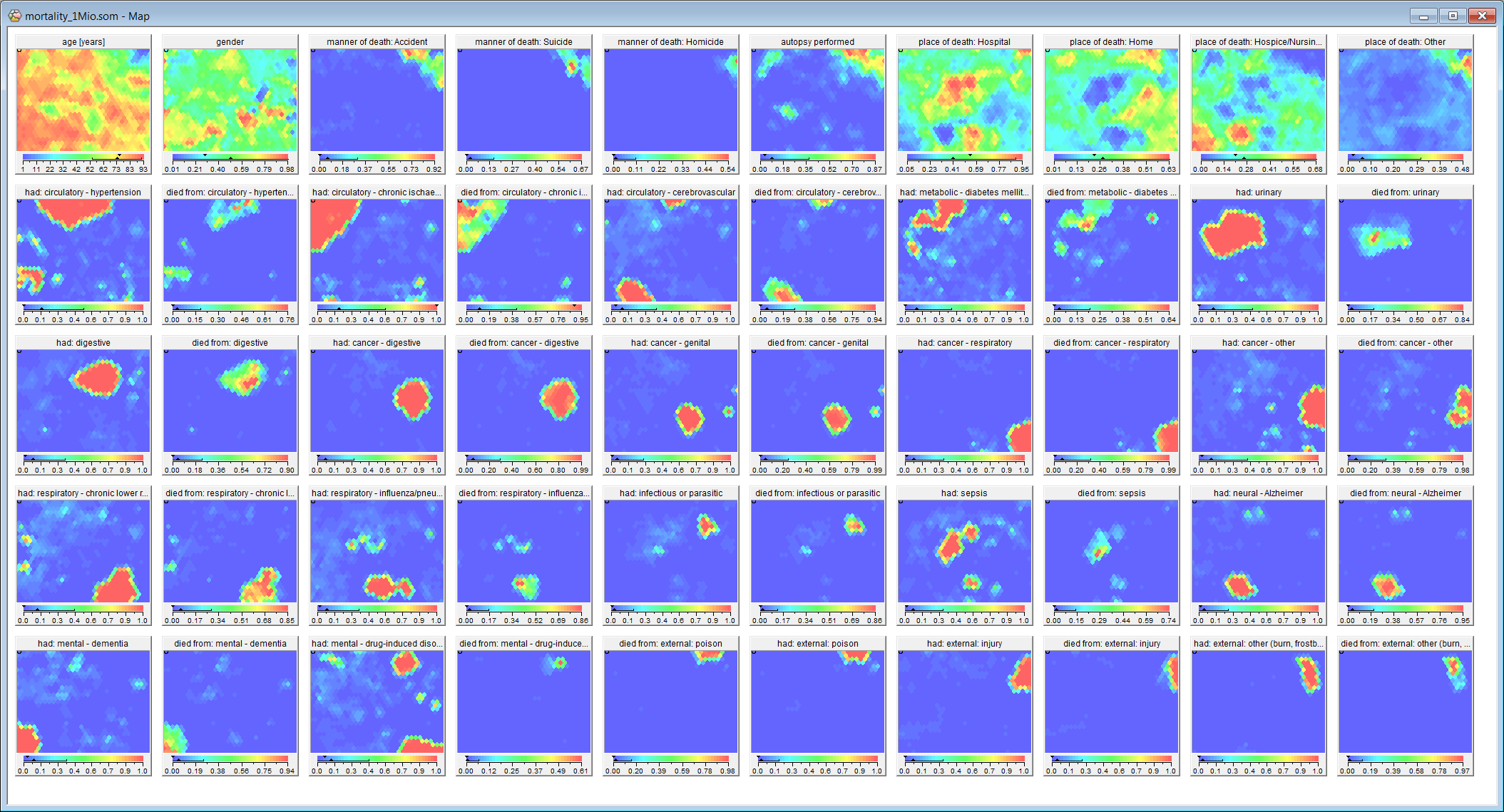
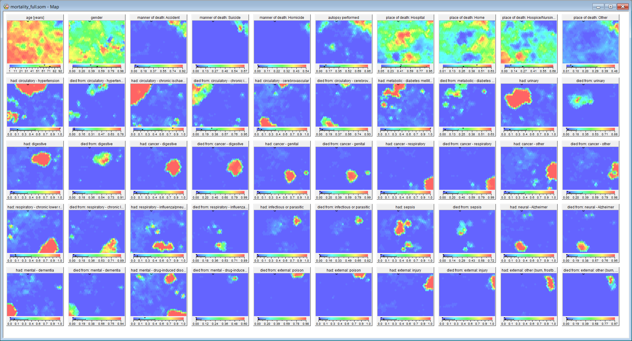
(Comparison of Viscovery maps and calculation times: 5% sample, 1.2 hours (left); full data set, 24.5 hours (right))
Advantages and benefit
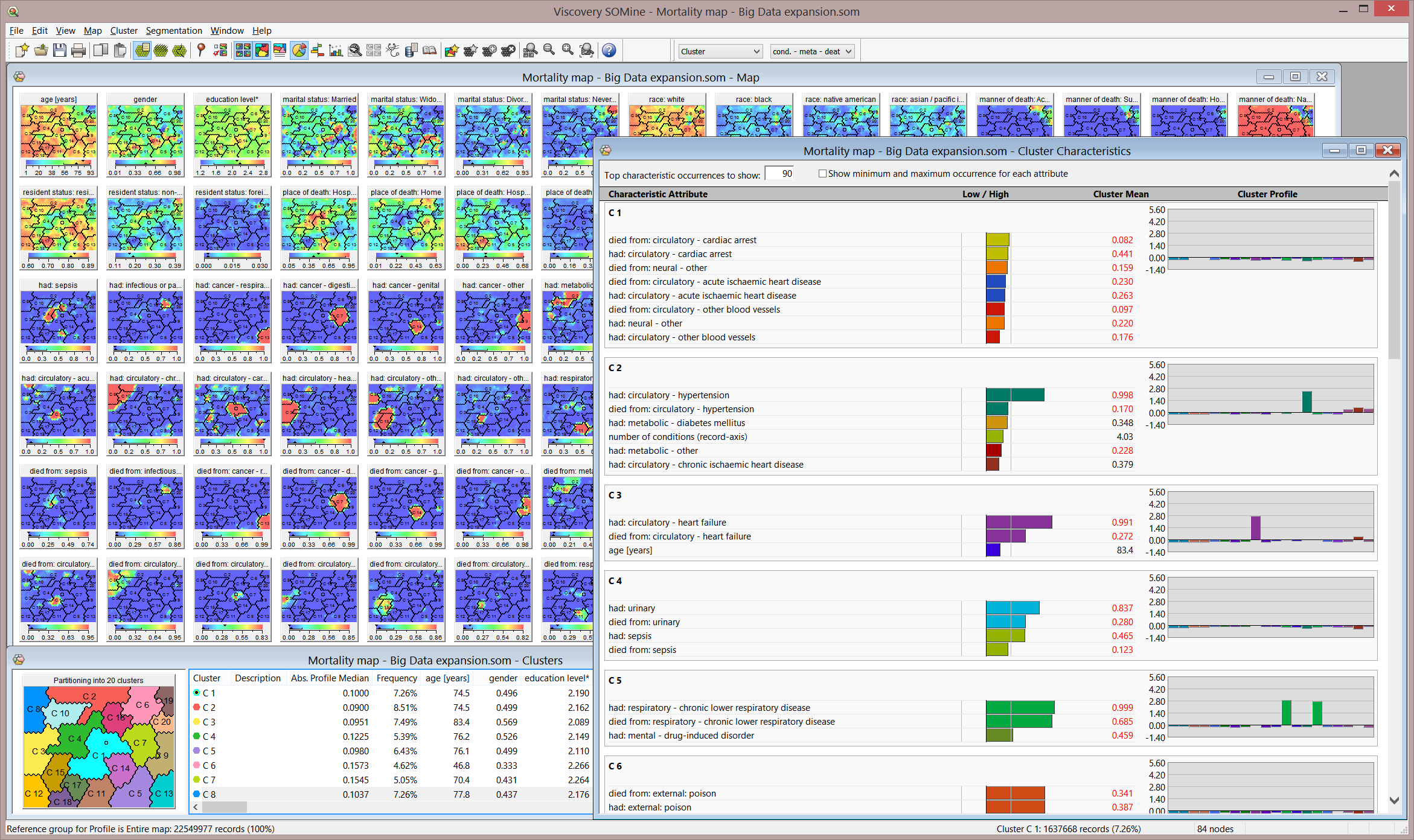
The map visualization provides instantaneous descriptive statistics as well as real-time access to original data records for arbitrary data selections. Advanced statistics is available for on-the-fly calculation. Clusters and statistical profiles can be created, modified and determined in fractions of a second, even for very large datasets.
With this feature, Viscovery provides a visual approach to Big Data when the calculation of a map would be far too time-consuming. Calculation times are thereby reduced by up to two orders of magnitude. The interactive clustering, exploration and profiling features allow decisions and actions to be derived directly from the map (see screenshot below).
 Click to enlarge and view model details.
Data source and acknowledgement
The dataset originates from the National Bureau of Economic Research and contains information about death certificates in the United States since 1959. We used data from the years 2006 to 2014 (in total, 22,549,978 records) because data from years before 2006 have different data structures.
Each death record contains person-specific data (e.g., age, gender, education), the manner of death (natural, accident, suicide, homicide), the underlying cause of death (e.g., intracerebral haemorrhage, breast cancer, injury, poisoning), along with health conditions mentioned in the death certificate, and death-specific metadata (e.g., place of death, weekday of death, autopsy).
Data preprocessing
The following preprocessing steps were performed in the Preprocess Data (formerly Preprocess) workflow of Viscovery.
The variable Detail Age was decoded to obtain the age in completed years. The variables Education (1989 revision) and Education (2003 revision) from the original data set where consolidated into a single attribute called education level. For children who died before they had the opportunity to finish school, this variable was set to missing.
The variables enicon_1 to enicon_20, which describe detailed health conditions noted on the death certificate in the ICD10 coding scheme, where subsumed into a multi-nominal attribute called had. The thousands of different codes in the ICD10 scheme were grouped into 30 meaningful categories which reflect major disease classes and death causes (e.g., infections, cancers, cerebrovascular diseases, accidents). For the died from attribute that describes the underlying cause of death, the same groups where used.
Viscovery map creation
The Viscovery map was created from a 5 % sample of the entire dataset (1,135,798 records) using the Explore Data (formerly Cluster) workflow of Viscovery. The following attribute priorities were used: 1.0 for age, 0.4 for gender and education level, 0.25 for had, 0.1 for marital status and race. For the variance/range scaling, the default mechanism of Viscovery was used.
The map was trained for approximately 1000 nodes with “Automatic map format”. The training schedule was “Accurate” with a tension of 0.5. The full data set was assigned to the map by running the Apply Classifier (formely Classify) workflow of Viscovery SOMine. The expanded model was exported by Save Copy As after completion of the Apply Model step.
For the map comparison with the full data model (see screenshot, right), the same parameters were used as for the sampled data.