How to read a SOM
A self-organizing map (SOM) may be the most compact way to represent a data distribution. Because SOMs represent complex data in an intuitive two-dimensional perceptional space, data dependencies can be understood easiliy if one is familiar with the map visualization. The following example provides an intuitive explanation of the basics of Viscovery visualization.

Imagine 1000 people on a football field. We define a number of attributes (e.g. gender, age, family status, income) and ask the people on the field to move closer to other people who are most similar to them according to all these attributes. After a while, everyone on the field is surrounded by those people that share similar attribute values. This configuration is an example of a two-dimensional representation of multi-dimensional data points.
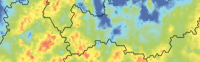
Now imagine that, looking over the crowd, you ask everyone to raise a colored flag according to their age (blue for <20, green for 20 to 29, yellow for 30 to 39, orange for 40 to 49, and red for 50 and over). The pattern of color that you see corresponds to the distribution of the attribute “Age” in the football field. Next you ask the crowd to remain in place and raise a colored flag according to their income, and so on for other attributes. For each attribute, you take a photo of the color distribution in the field. This color pattern corresponds to the color-coded maps visualized within Viscovery software.

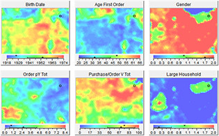
Finally, you can put all the photos side by side and inspect the dependencies. For example, you might see clusters of younger people (blue/green) as well as clusters of older people (orange/red). Further, you could detect some correlation between age clusters and income clusters: e.g., higher incomes occur in older groups. Continuing in this manner, you will discover further relationships among the defined attributes.
Learn more about features and benefits of, and solutions using, Viscovery software.